The kitchen is universally acknowledged as the most important room when it comes to home valuation and saleability. A well-designed kitchen can command a higher selling price and dramatically shorten the time a house sits on the market. Conversely, an outdated kitchen, dominated by unfortunate design choices, can instantly repel buyers and force you into significant price reductions.
Among the various elements—countertops, appliances, and layout—cabinet color holds the most significant power to boost or tank your home’s value. Cabinets cover the largest surface area of the kitchen, setting the entire tone and style.
While many cabinet colors come and go with trends, there is one particular hue that stands out as the biggest threat to your home’s equity and appeal: Orange-Tinged Oak Wood Stain.
This article explores why the specific tone of orange-tinged oak has become the most universally despised cabinet color in the current market, detailing the psychological and practical reasons it hurts home value, and offering guidance on high-ROI alternatives.
I. The Rise and Fall of the Orange Oak Cabinet
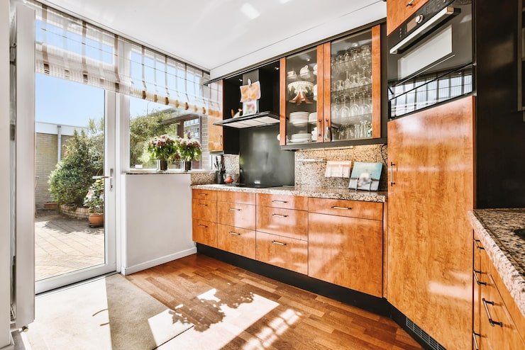
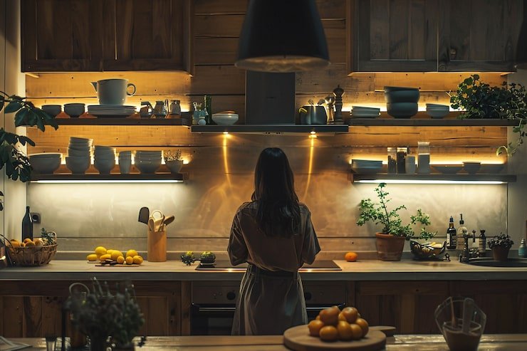
The cabinets in question are not the clean, neutral light oaks or white oaks popular in Scandinavian or modern design. We are referring to the dominant cabinet style from the late 1980s through the 1990s and early 2000s—typically featuring raised-panel doors and finished with a heavy, yellow-orange, or amber-toned stain.
A Sign of Instant Antiquity
The biggest problem with this specific shade of oak is that it acts as an unmistakable visual time stamp. Buyers walking into a kitchen with this flooring immediately perceive the space as being 20 to 30 years old, regardless of the condition of the appliances or countertops. This instant association with an outdated era triggers an immediate negative reaction:
- Perception of Cost: Buyers mentally calculate the cost of a full kitchen remodel, not just a cosmetic update. They assume the orange cabinets signal old appliances, poor lighting, and a problematic layout, leading them to dramatically discount their offer.
- Lack of Style Neutrality: Unlike a classic white or deep navy, the orange-oak stain limits every single decorating choice. It clashes with modern paint colors, contemporary hardware, and popular countertop materials like gray quartz or white marble.
II. The Psychological Reasons It Tanks Value
The aversion to the heavy orange-oak color is rooted in several key psychological factors that affect buyer perception:
1. The Clash with Modern Light
Contemporary home design heavily favors cool, bright, and neutral tones—whites, grays, and soft beiges. Modern LED lighting is often cool-toned as well.
- When cool light hits the warm, heavy orange cabinets, the tones clash sharply. The cabinets can appear even more yellowed or brassy, creating an unappealing visual dissonance that makes the kitchen feel jarring and stressful rather than calming and inviting.
2. Association with Heaviness and Dark Spaces
The deep, warm stain of older oak cabinets makes the kitchen feel darker, smaller, and heavier.
- Modern buyers prioritize bright, open-concept spaces. The presence of dark, heavy cabinetry, especially when paired with older black or dark granite countertops (another common pairing from that era), works against this desire for light and airiness, making the space feel oppressive.
3. The “Dated” Tax
A home sale is largely an emotional purchase. Buyers are looking for a dream, not a project. When a buyer encounters orange-oak cabinets, they immediately apply a “dated tax”—a monetary deduction from the asking price to cover the perceived expense of remediation.
- This deduction is often significantly more than the actual cost of painting the cabinets. The buyer assumes the worst, factoring in labor, materials, and the inconvenience of living through a kitchen reno.
III. Other Cabinet Colors That Should Be Avoided
While orange-tinged oak is the worst offender, other choices can similarly hurt your home’s value by being overly specific, temporary fads, or high-maintenance:
| Color/Style | Why It Tanks Value | Buyer’s Perception |
| Overly Distressed Finishes | Dated trend. Finishes like heavy crackle or “antiquing” paint treatments that were popular in the early 2000s now look fake and shabby, suggesting a cover-up rather than quality. | “This looks cheap and dirty; I have to strip this whole thing.” |
| Avocado Green or Harvest Gold | Severely dated trend. Colors strongly associated with the 1960s/1970s that only appeal to a niche market looking for true retro style. | “This requires a gut remodel.” |
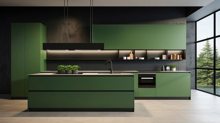
| Trendy, Hyper-Specific Colors | Too polarizing. Colors like hot pink, electric blue, or lime green severely limit your buyer pool. They may be perfect for one person but impossible for everyone else. | “I love the house, but I hate the kitchen color and will have to change it.” |
| Very High-Gloss Black or Red | High maintenance. While sleek, these finishes show every fingerprint, dust speck, and smudge. Buyers perceive them as too much work to keep clean. | “This looks great in photos, but I know it’ll look dirty every day.” |
IV. The High-ROI Alternatives: Colors That Sell Homes
If you are preparing to sell, addressing the cabinet color is the most effective and high-ROI upgrade you can make. Painting the existing cabinetry (if it is structurally sound) is far cheaper than a full replacement and can dramatically change the perceived value.
The highest-value, universally accepted cabinet colors are:
1. Classic White (The Safest Bet)
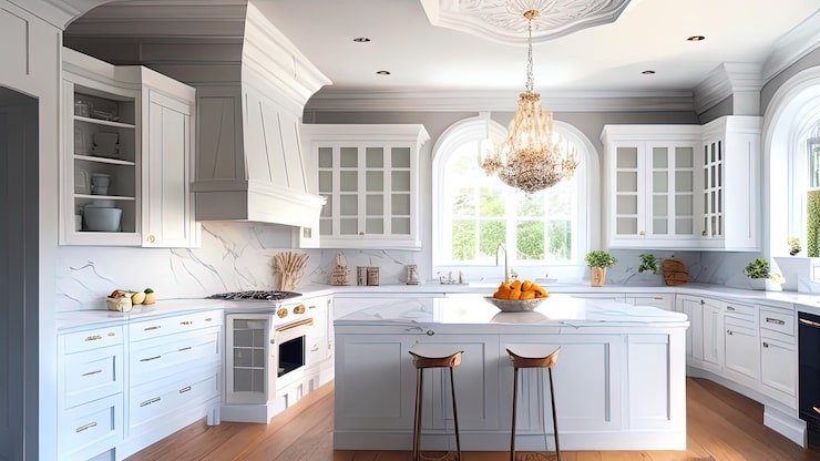
- Why it works: White reflects light, making the kitchen feel larger, brighter, and cleaner. It is timeless, appeals to every style (modern, farmhouse, traditional), and provides a clean canvas for buyers to visualize their own decor.
- Best Tones: Avoid stark, industrial white. Choose a soft, creamy white or one with a barely perceptible gray undertone to prevent it from looking too institutional.
2. Light Neutral Gray (The Modern Standard)
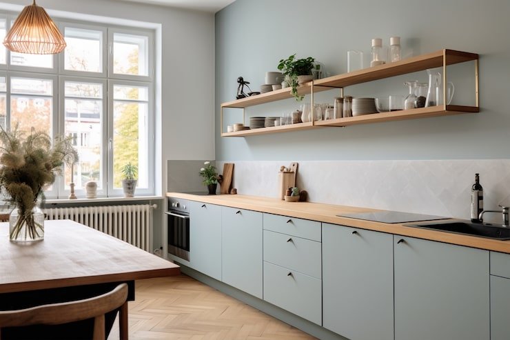
- Why it works: Light gray acts as a neutral while providing more dimension than white. It pairs beautifully with stainless steel appliances and popular white or marble-look countertops, establishing a sophisticated, contemporary feel.
- Best Tones: Focus on warm grays (greiges) or soft pale grays.
3. Deep Navy or Forest Green (The Statement Piece)
- Why it works: Used primarily on lower cabinets in a two-toned kitchen (paired with white upper cabinets), dark colors add elegance and grounding without overpowering the room. This looks high-end and intentional.
- Value Tip: Use a deep color only on the island or lower cabinets to maximize the sense of space and light.
Conclusion
The orange-tinged oak cabinet is more than just a preference issue; it is a financial liability. It instantly dates your home by decades, signals high future renovation costs to the buyer, and creates an aesthetically clashing environment.
To maximize your home’s resale value, prioritize the removal or repainting of these time-stamped cabinets into a soft, clean, and neutral color. This single change is often the most cost-effective way to transition a kitchen from an immediate liability into a powerful selling feature.