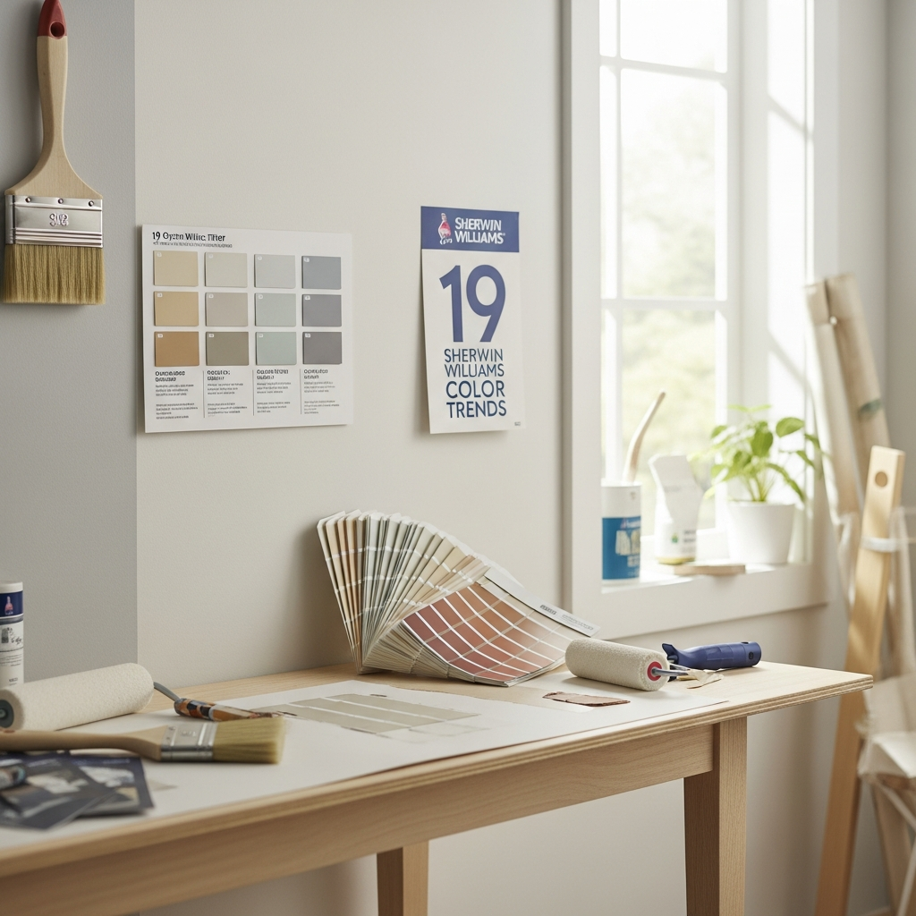
Stepping into the world of home decor often begins with a single, transformative decision: the perfect paint color. Sherwin Williams, a name synonymous with quality and innovation in paint, consistently sets the tone for interior design with their carefully curated color palettes. Understanding these trends can unlock endless possibilities for refreshing your living spaces, creating moods, and reflecting your personal style.
Join us as we explore 19 Sherwin Williams paint color trends that are shaping beautiful homes today. From soothing neutrals to earthy greens and dramatic blues, these selections offer inspiration to elevate every room in your house, making it feel fresh, current, and utterly inviting.
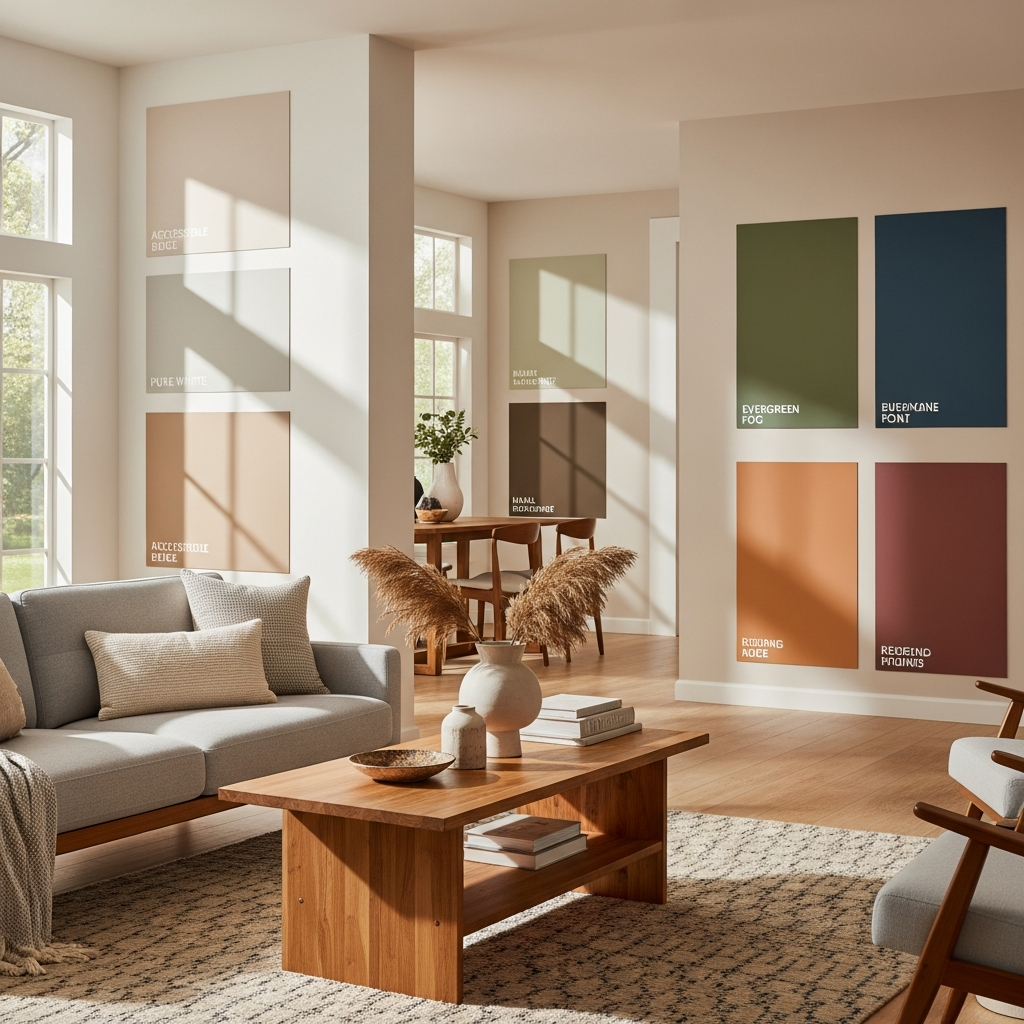
1. Evergreen Fog (SW 9130)
Evergreen Fog is a beautiful, muted green-gray that brings the tranquility of nature indoors. It offers a sophisticated organic touch, making any space feel calm and grounded. This versatile shade works wonderfully as a main wall color, providing a serene backdrop for both modern and traditional decor.
Pair it with warm wood tones like walnut or oak, brushed brass accents, and creamy white textiles. Imagine a living room with a comfortable linen sofa, a chunky knit throw, and a collection of ceramic vases, all bathed in the gentle embrace of Evergreen Fog.
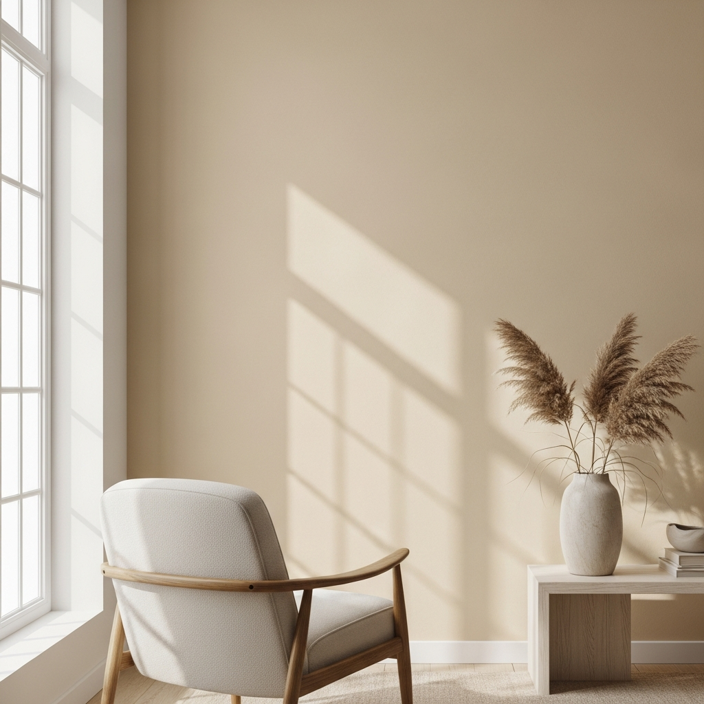
2. Accessible Beige (SW 7036)
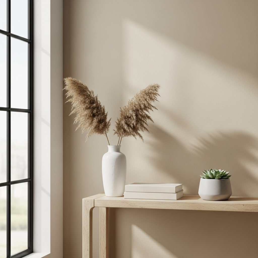
Accessible Beige is a beloved neutral for good reason. It’s a warm, gentle greige that bridges the gap between traditional beige and contemporary gray, offering a perfect balance without leaning too yellow or too cool. This timeless hue creates an inviting and versatile foundation for any room.
It shines in living rooms, bedrooms, and open-concept areas, pairing beautifully with natural textures like rattan, jute, and light woods. Introduce deep green plants and a mix of soft whites and creams for a serene, cohesive look that feels both light and cozy.
3. Agreeable Gray (SW 7029)
Another star in the greige family, Agreeable Gray is slightly cooler than Accessible Beige but still holds enough warmth to prevent a cold feeling. It’s incredibly adaptable, making it a popular choice for homeowners seeking a true chameleon color that shifts beautifully with different lighting.
This shade provides a fantastic canvas for various decor styles, from farmhouse chic to minimalist modern. Consider it for a kitchen paired with white cabinetry and marble countertops, or in a bedroom with rich navy blue accents and crisp white bedding.
4. Pure White (SW 7005)
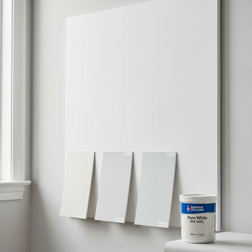
Pure White is exactly as its name suggests: a clean, crisp white with virtually no discernible undertones. It’s the go-to choice for creating bright, airy spaces that feel expansive and fresh. This classic white allows architectural details to shine and makes other colors pop.
Use it on walls, trim, and ceilings to achieve a truly luminous effect. It’s the perfect backdrop for vibrant artwork, sleek black furniture, or colorful textiles, creating a gallery-like atmosphere in any contemporary or classic interior.
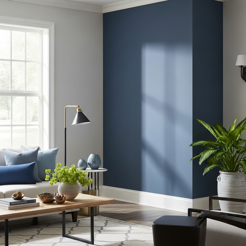
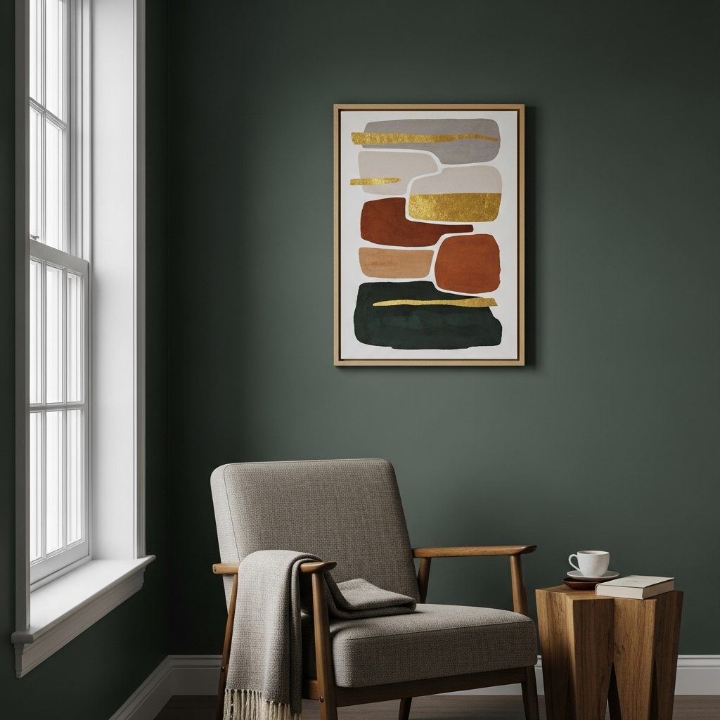
5. Naval (SW 6244)
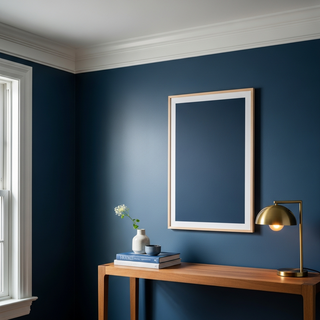
Naval is a deep, sophisticated navy blue that brings a touch of dramatic elegance to a room. It evokes a sense of calm and classic luxury, making it ideal for creating a statement without being overwhelming. This rich color works beautifully in various settings.
Imagine Naval on an accent wall in a dining room, paired with a dark wood table and gold lighting fixtures for a luxurious feel. In a study or office, it offers a focused and distinguished atmosphere, complementing leather furniture and polished chrome accents.
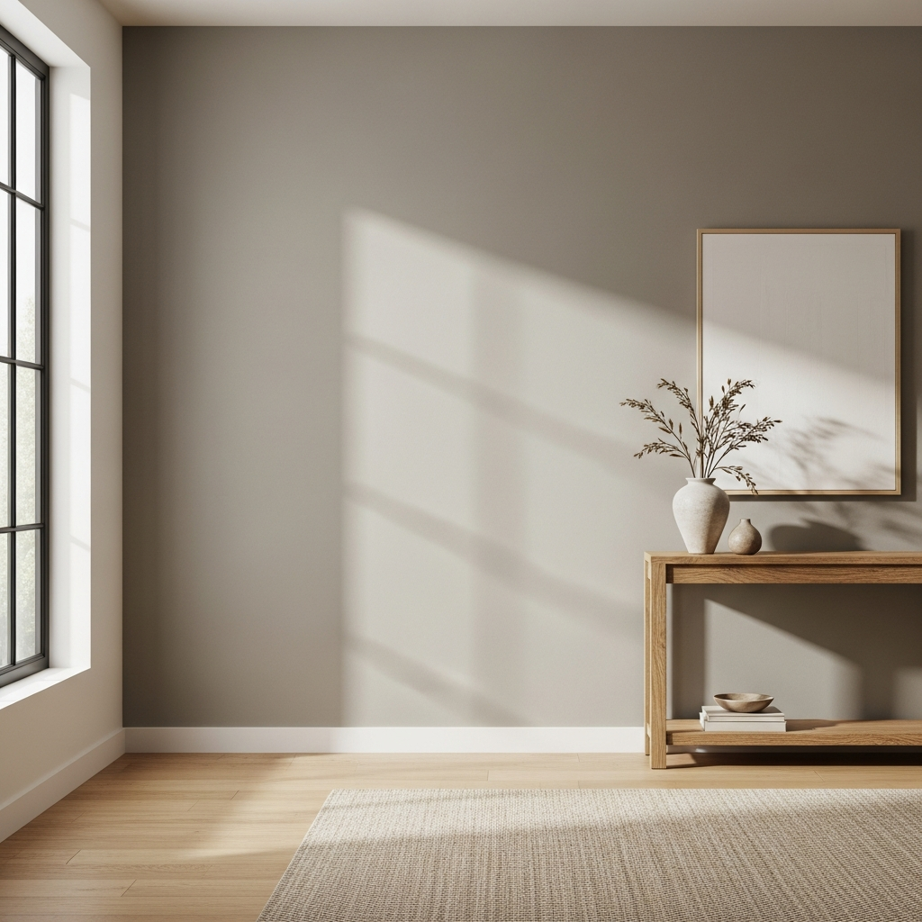
6. Urbane Bronze (SW 7048)
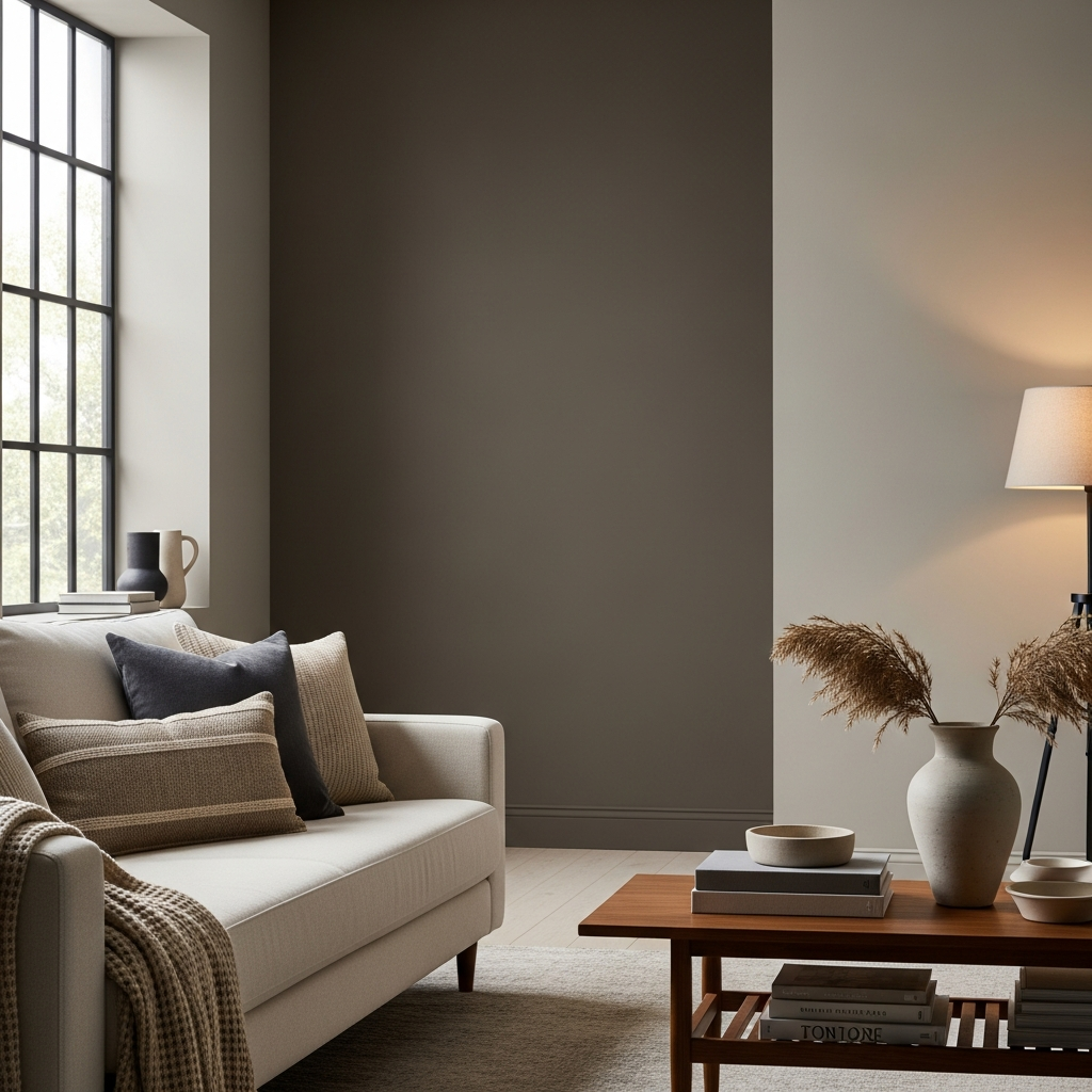
Urbane Bronze is a deep, grounding color with a touch of warmth, reminiscent of natural stone or weathered metal. It’s a sophisticated dark neutral that promotes a sense of comfort and stability. This earthy shade connects interiors with the natural world.
It can be used to create a moody, intimate atmosphere in a bedroom or as a dramatic accent in a living room. Pair it with lighter wood tones, creamy fabrics, and black metal details for an industrial-chic or Japandi-inspired aesthetic.
7. Sedate Gray (SW 6169)
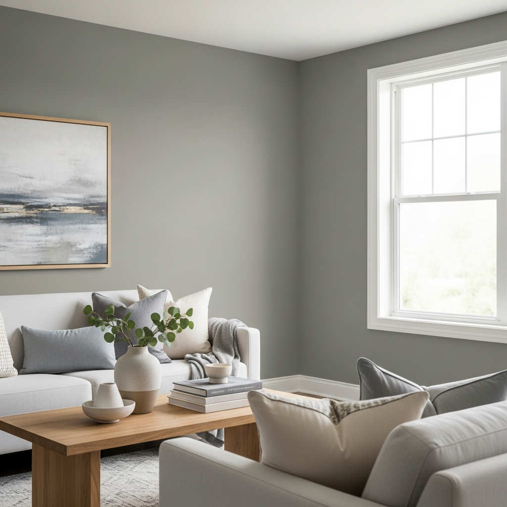
Sedate Gray is a warm, soft gray with subtle beige undertones, offering a comforting and understated presence. It’s a wonderful choice for those who desire a gentle neutral that feels inviting rather than stark. This color effortlessly blends into various decor schemes.
It works well in bedrooms and nurseries, fostering a tranquil environment. Complement Sedate Gray with pale blues, soft greens, and natural linen textures to enhance its calming appeal, creating a restful retreat.
8. Clary Sage (SW 6178)
Clary Sage is a delicate, muted green that exudes a sense of tranquility and earthiness. It’s a soft, botanical hue that provides a refreshing connection to nature, making spaces feel light and serene. This gentle color promotes well-being and calm.
Perfect for bathrooms, kitchens, or sunrooms, it pairs beautifully with white subway tile, light oak cabinetry, and potted plants. Add touches of rattan or wicker for a relaxed, spa-like atmosphere that feels rejuvenating.
9. Sea Salt (SW 6204)
Sea Salt is a captivating blend of gray, blue, and green, creating a light and airy coastal feel. It’s known for its ability to shift colors depending on the light, always remaining soft and inviting. This versatile hue brings a breezy calm to any space.
It’s a popular choice for bathrooms and bedrooms due to its spa-like qualities. Combine it with crisp white trim, natural wood floors, and silver or brushed nickel fixtures for a refreshing and timeless look.
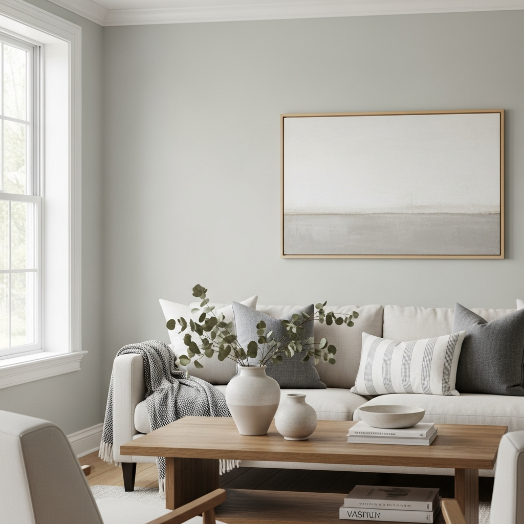
10. Repose Gray (SW 7015)
Repose Gray is a true medium greige that offers a touch more warmth than some pure grays. It’s incredibly balanced, with subtle brown undertones preventing it from ever looking cold. This popular color is a go-to for designers seeking a sophisticated backdrop.
It’s excellent for open-concept living areas, offering a cohesive flow throughout the home. It pairs beautifully with both dark and light wood furniture, and can be accented with jewel tones like deep teal or mustard yellow for a pop of personality.
11. Oyster White (SW 7637)
Oyster White is a sophisticated off-white that carries a hint of warmth without leaning yellow. It offers a soft, creamy richness that feels comforting and elegant, creating a gentle canvas for other colors and textures. This shade is perfect for a cozy yet refined aesthetic.
Consider it for dining rooms or master bedrooms, providing a luxurious backdrop for velvet chairs, antique mirrors, and golden-hued lighting. It beautifully complements dark wood furniture and rich fabric patterns.
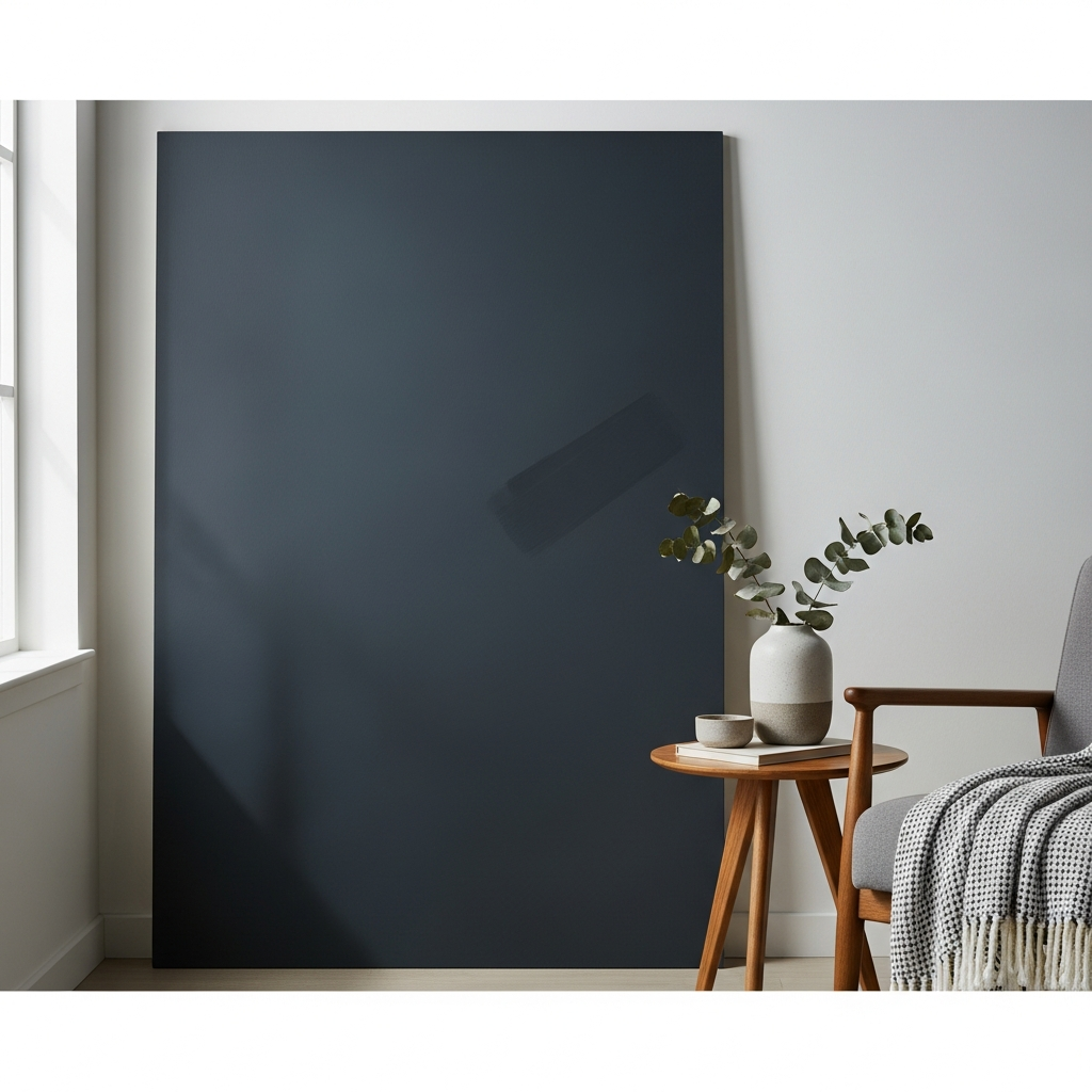
12. Tricorn Black (SW 6258)
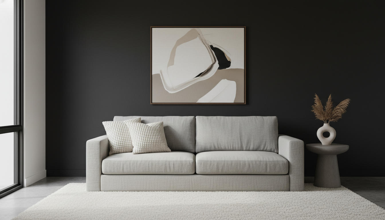
Tricorn Black is a true, deep black with no discernible undertones, making it a bold and dramatic choice. It provides ultimate contrast and sophistication, perfect for creating powerful focal points or adding depth to a space. This color offers a touch of modern drama.
Use it on an accent wall, kitchen island, or built-in bookshelves to make a striking statement. It pairs exceptionally well with bright whites, natural wood, and metallic accents like brass or chrome for a chic, contemporary look.
13. Gale Force (SW 7601)
Gale Force is a rich, moody blue-green that evokes the depth of the ocean or a stormy sky. It’s a striking color that adds drama and personality to a room, creating a cozy yet impactful atmosphere. This deep hue commands attention.
Perfect for a sophisticated powder room, an intimate reading nook, or a dramatic dining room. Complement it with dark wood furniture, gilded mirrors, and luxurious textures like velvet or faux fur for an opulent touch.
14. Redend Point (SW 9122)
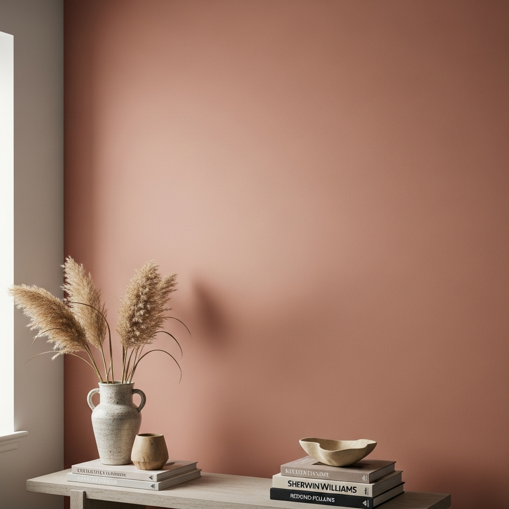
Redend Point is a warm, blush-beige with subtle pink and terracotta undertones. It’s an earthy, comforting hue that feels soft, grounded, and incredibly inviting. This color was chosen as the Sherwin Williams Color of the Year, reflecting a desire for warmth and connection.
It’s fantastic in bedrooms or living areas, creating a nurturing environment. Pair it with light, organic textures, natural wood furniture, and creamy whites. Consider a bohemian-inspired space with macrame wall hangings and lots of natural light.
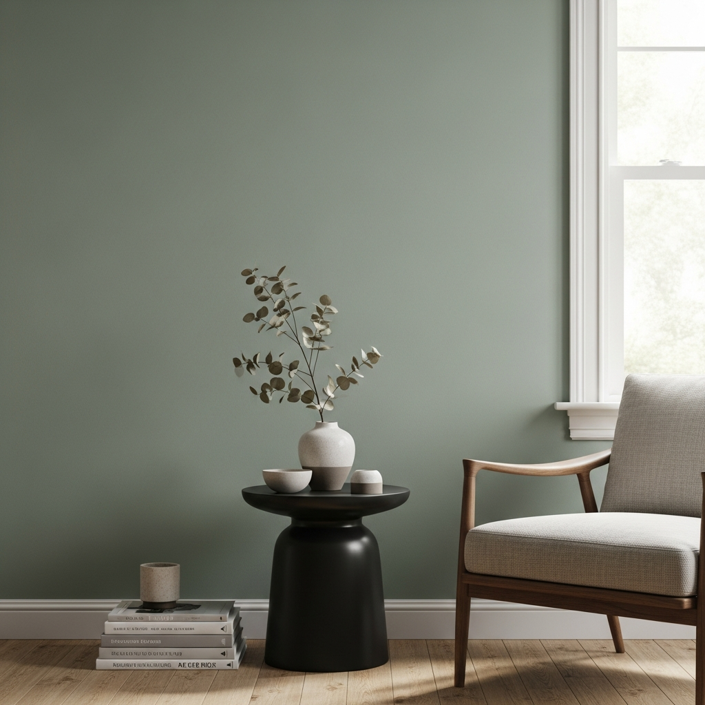
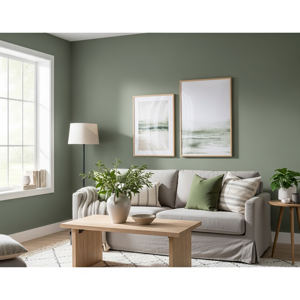
15. Pewter Green (SW 6208)
Pewter Green is a sophisticated, deep green with gray undertones, offering a stately and calming presence. It brings a touch of classic elegance and nature-inspired tranquility to any interior. This versatile green works in many different styles.
Ideal for cabinetry in a kitchen or a feature wall in a traditional living room. It pairs beautifully with dark cherry wood, rich leather upholstery, and antique brass fixtures for a timeless and refined aesthetic.
16. Kilim Beige (SW 6106)
Kilim Beige is a warm, inviting beige with noticeable red-orange undertones, giving it a cozy and enveloping feel. It’s a classic choice for creating a homey atmosphere that feels both comforting and versatile. This color has stood the test of time.
It works wonderfully in family rooms and entryways, providing a welcoming embrace. Layer it with rustic wood furniture, patterned rugs, and pops of warmer colors like terracotta or olive green for a rich, textured look.
17. Gossamer Veil (SW 9165)
Gossamer Veil is a light, ethereal gray-beige that provides a subtle warmth and softness. It’s a very gentle neutral that offers a whisper of color without being overpowering, perfect for creating understated elegance. This delicate shade opens up a room.
It’s an excellent choice for a minimalist or Scandinavian-inspired interior. Pair it with light-colored woods, crisp white trim, and simple, functional furniture with clean lines. Add texture through natural wool throws and subtle patterns.
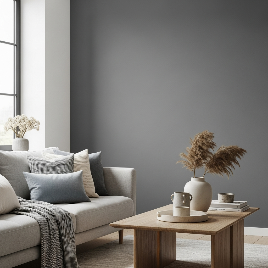
18. Iron Ore (SW 7069)
Iron Ore is a soft, deep charcoal that has gained immense popularity for its ability to create dramatic contrast without the starkness of true black. It’s a sophisticated dark neutral that grounds a space and adds modern elegance. This color offers depth and visual weight.
Use it on exterior doors, accent walls, or even kitchen cabinets for a contemporary update. It looks striking alongside bright whites, rich greens, and metallic elements like polished nickel or brass.
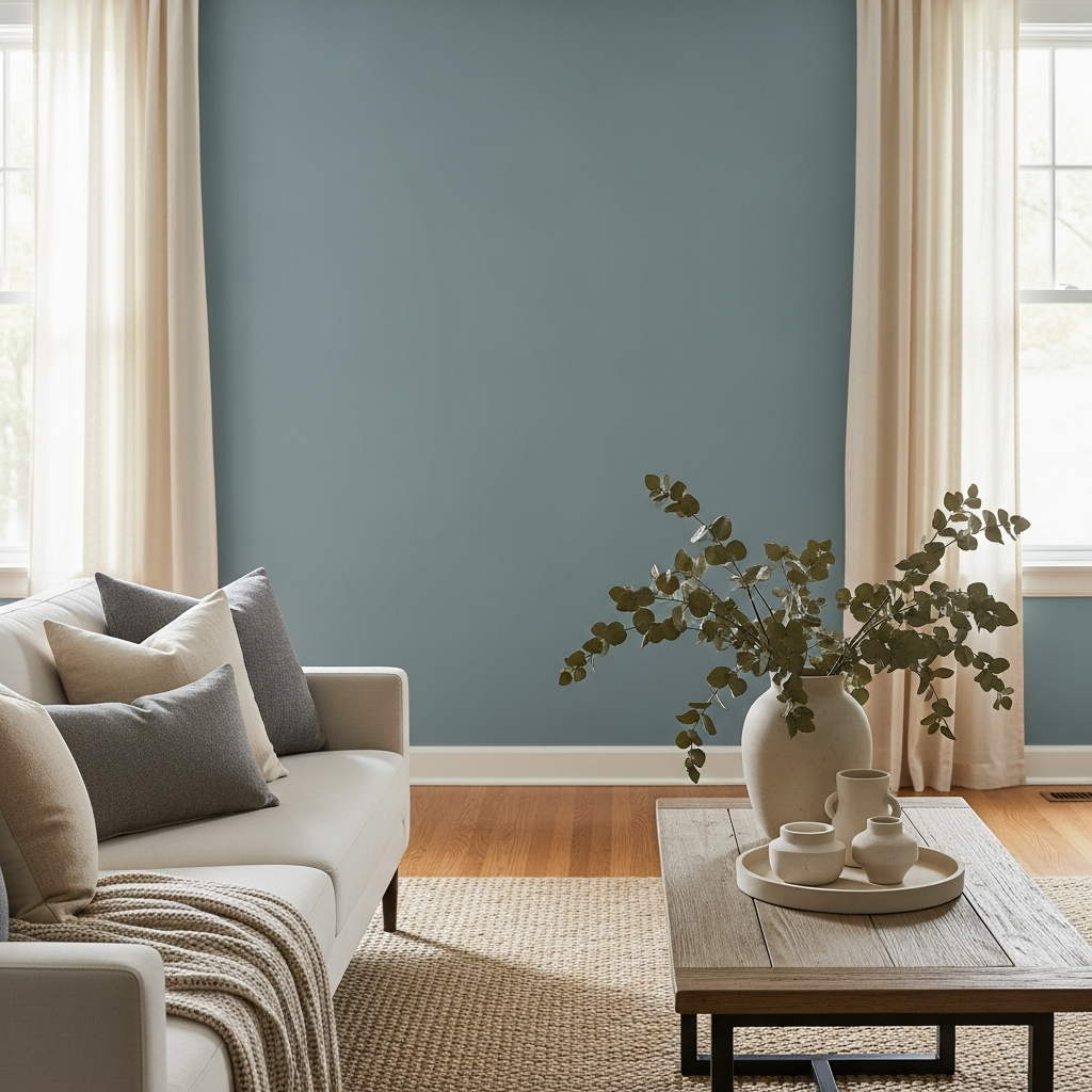
19. Stardew (SW 9138)
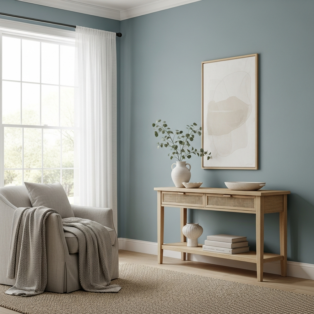
Stardew is a light, muted blue-gray that offers a calming and refreshing vibe. It’s a subtle hue that beautifully blends cool and warm elements, making it incredibly adaptable and soothing. This color creates a serene atmosphere.
Perfect for a peaceful bedroom or a spa-like bathroom. Pair it with crisp white towels, light wood furniture, and soft, natural textures. Introduce elements like seashells or beach glass for a gentle coastal feel.
Choosing a new paint color is an exciting journey that can completely transform your home. These 19 Sherwin Williams paint color trends offer a rich palette of inspiration, from the deepest, most grounding hues to the lightest, most ethereal shades. Experiment with these trending colors to create spaces that not only look beautiful but also truly feel like home, reflecting your unique style and fostering the atmosphere you desire. Embrace the power of color and let your imagination bring these trends to life in your living spaces.